Online recourses help monitoring coronavirus spread

Viruses do not recognize national boundaries. Today, medical specialists and scientists from all over the world line up to develop a vaccine, find treatment methods and other possibilities to fight against coronavirus.
Various online recourses help world organizations and institutions, mass media, governments and citizens monitor the rapid virus spread situation. In spite of these recourses differ in coverage and have many specific features, their main goal is to show the truthful picture of the COVID-19 cases, lethal cases and recoveries, as well as to forecast the pace of developments. Geoinformation technologies allow us to see how pandemic develops in other countries and regions, to wake up to this alarming situation, and to take measures to get over the virus as soon as possible.
There are a lot of recourses showing the current situation with coronavirus generally around the world, in different countries and cities. Everybody can view the pandemic spread on the global online map developed by Johns Hopkins University (https://coronavirus.jhu.edu/map.html), where information about confirmed COVID-19 cases, number of deaths, daily dynamics of new cases, and number of recoveries is shown. Otherwise, you can refer to another information recourse created by the New York Times journalists, which is an ongoing repository of data on coronavirus cases and deaths in the U.S. counties (https://www.nytimes.com/interactive/2020/us/coronavirus-us-cases.html).
Several popular services for monitoring COVID-19 pandemic have been created by Esri and Data East team has also contributed to their development. For example, using Esri’s ArcGIS Business Analyst software product the statistical data on COVID-19 was calculated and various infographic reports for more than 3000 US counties were generated. Below you can find our review of the world most reliable and informative online recourses dedicated to coronavirus situation created with the participation of scientists and specialists from different areas of medicine, science and technology.
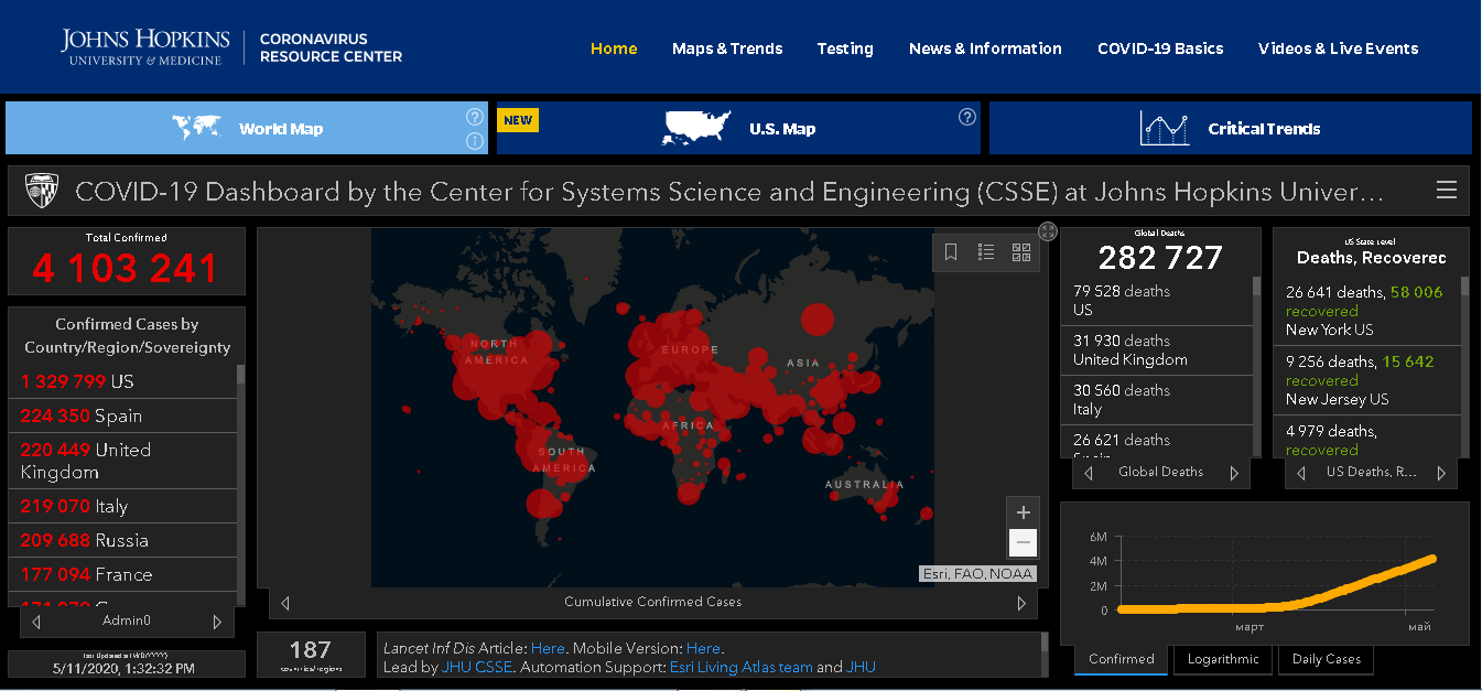
Fig. 1 Online recourse COVID-19 Dashboard of Johns Hopkins University
Johns Hopkins University experts in global public health, infectious disease, and emergency preparedness have developed the COVID-19 Dashboard (https://coronavirus.jhu.edu/map.html), which is a resource to help advance the understanding of the virus, inform the public, and brief policymakers in order to guide a response, improve care, and save lives. The COVID-19 data shown on this dashboard has been carefully selected from various sources, starting from the World Health Organization data to information from world news aggregators and social networks. Besides, the University has its own system of anomalies prevention, that notifies about discrepancies found in the reports about coronavirus cases that are collected and analyzed automatically. Esri’s development team has created a cartographic software for this recourse and provides technical support for overall work of the project. The dark map covered with red circles (fig.1) shows data about confirmed coronavirus cases, deaths and recoveries, tendency graphs, and other information regarding situation globally and also sorted by countries, regions and counties. The core principle of the dashboard’s developers was to avoid any fancy graphics, as everything should be clear and visible. The website has more than 1 billion visitors a day, it is now one of the most reliable sources with information about COVID-19 cases. The data published at this site is used and distributed by media portals, governmental bodies, and people around the world. Online maps of various regions and countries have been created according to sample of the COVID-19 Dashboard.
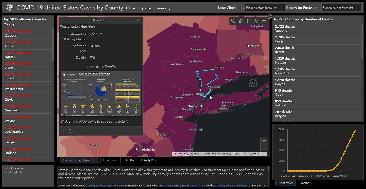
Fig. 2 Data about COVID-19 cases in Westchester, New York
At the COVID-19 Dashboard you can view infographics for each US county. For example, fig.2 demonstrates infographics for Westchester about nationality of diseased people, their age, availability of health insurance, number of intensive care beds in hospitals. There is also data about county population and number of elderly people of 65+ being at risk, and data about conducted coronavirus tests, confirmed cases and fatality rate (fig.3).
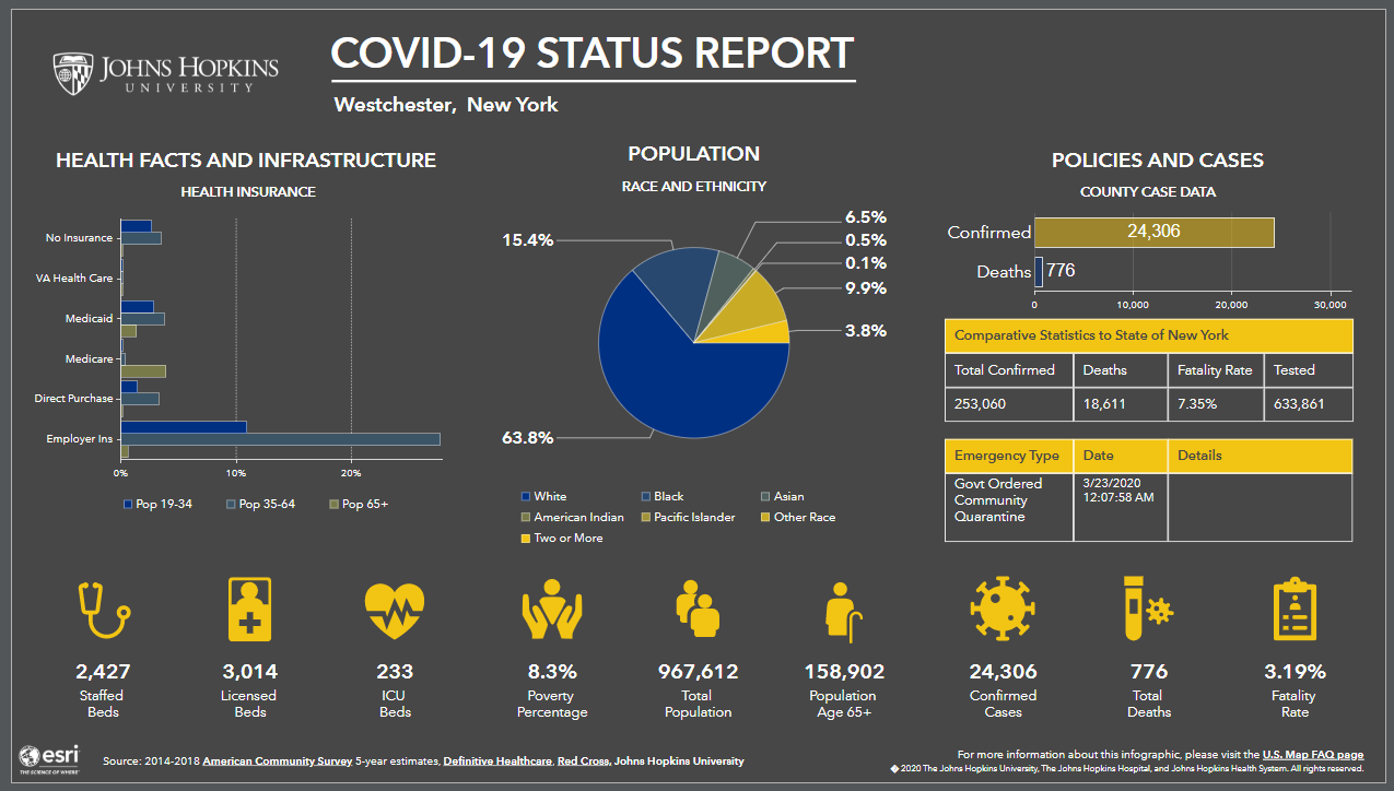
Fig. 3 Infographic status report for Westchester, New York
Besides global websites that collect information from all over the world, there are various local resources that help local administrations follow the situation and calculate possible economical risks for their regions. For example, website called California Impact Planning for COVID-19 (https://www.arcgis.com/apps/opsdashboard/index.html#/8b2790edea074d758c0ed224dcba3094) mostly targets the state institutions and businesses and provides information about calculation of risks from coronavirus spread. The infographics on fig.4 shows the households wealth level, number of businesses and employed citizens in California counties. You can also see information about the population age, level of English speaking skills, availability of health insurance, and people being at risk (below the poverty level, at age of 65+, without vehicle, etc.)
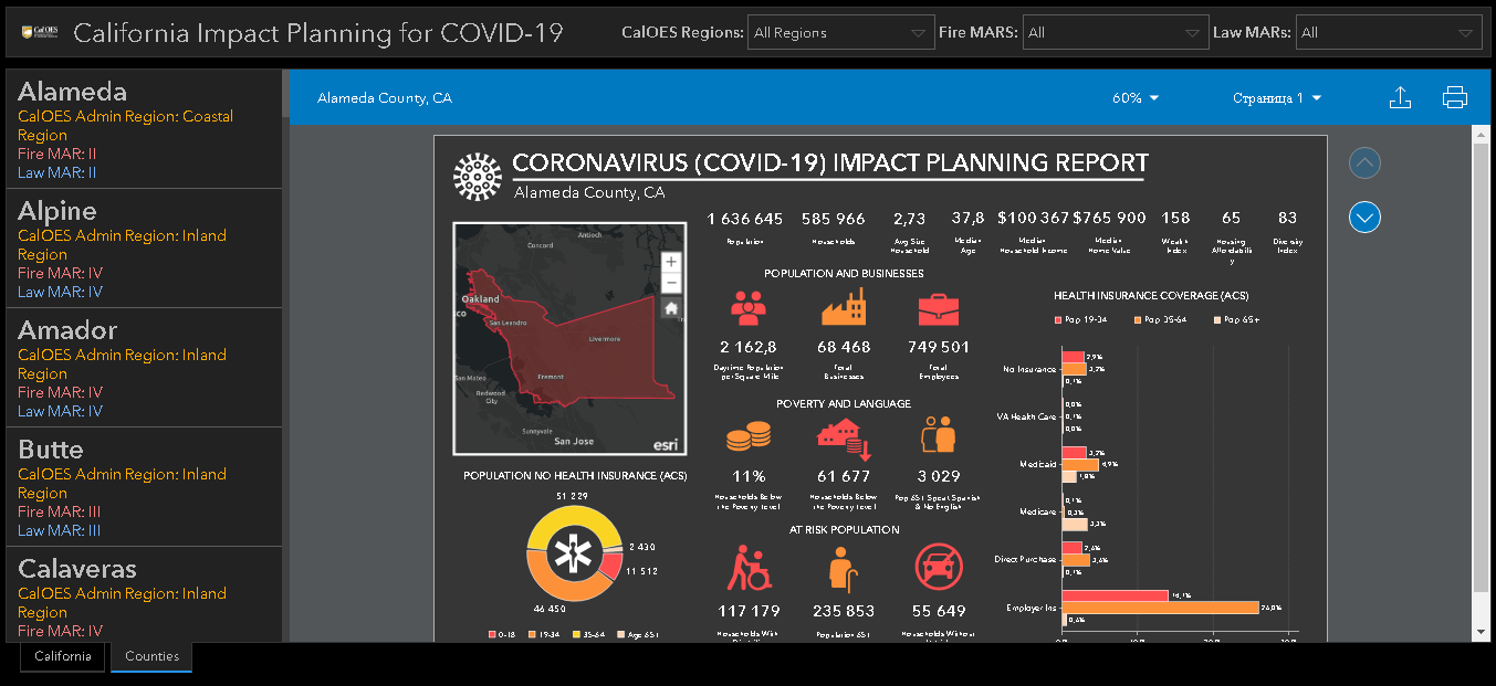
Fig. 4. Estimation of COVID-19 risks for Alameda County, California
Similar estimations and graphs are shown at the website dedicated to COVID-19 situation in Arizona (https://bateam.maps.arcgis.com/apps/opsdashboard/index.html#/67027a9834cc4f7b8f58a308a72c2786).
Another online service provided for forecasting the situation and analyzing risks is Impact Planning for COVID-19, containing information not only about the average households income, employed citizens and business areas where they work, but also information about availability of intensive care beds in hospitals, female and male ratio, average population age, and number of students at schools and colleges. The online map allows estimating the overall hospitals load regarding the citizens categories being at risk (fig 5, 6). Using this map, the county executives can develop all the necessary measures to minimize negative influence of COVID-19 on citizens and county economics in general.
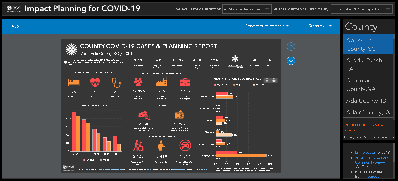
Fig. 5 Forecasting coronavirus impact on population of Abbeville County, South Carolina
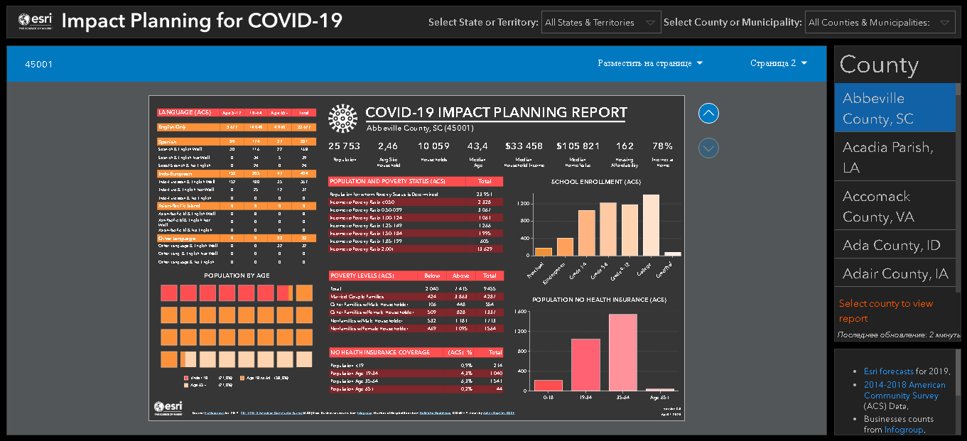
Fig. 6 Calculation of statistics of coronavirus impact on population of Abbeville County, South Carolina
Collection and analyses of data about coronavirus spread is a hard work that is not possible without using up-to-date geoinformation technologies. Collaborating with the world best GIS developers and analytics from Esri, Data East contributes to development of online services providing complete and reliable information about the pandemic. Reach experience in development of software solutions for federal governments and environmental organizations allows Data East to help solving global tasks for people around the world. No matter how difficult these task are, starting from development of smart city solutions and solutions for managing forest resources of Great Britain, to solutions for saving Alaska fishing recourses and rare orchids in Siberia, Data East’s development team is always ready to meet any challenge, is open to innovative ideas and welcomes talented youth in the company. The created products and services work for the benefit of global society and make our world better, as they are used to take decisions in managing cities and countries every day. And of course today, in the current public health emergency situation, it is very important to combine efforts of all the technical specialists, governments, scientists, medical specialists, and responsible citizens, as only together we will be able to reverse the situation and to address the COVID-19 problem.